Thursday, 12 March 2009
Wednesday, 11 March 2009
Final Opening Feedback
Positives:
- Showed the drug taking (Suggestion shot), its effective as its a ghost shot, emphasises the effects.
- The soundtrack with real sounds underneath is effective.
- Good titles
- Range of shots, shot duration and angles
- Effective range of angles that show different views of the character.
- The music sets the mood.
- Not much content
- Some mise-en-scene against stereotypes
- Prompt ending, we should have a more subtle ending.
Thursday, 5 March 2009
Soundtrack
We decided to make the soundtrack a bit sad to reflect the feelings of the male character. The soundtrack runs smooth with the sequence as the shots and sounds are effective by drawing in the spectator.

We used orchestral sounds and emotional piano sounds to also reflect the emotions and feelings of the male character.
Effects
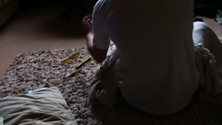
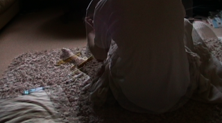
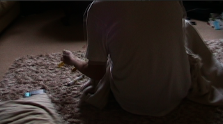
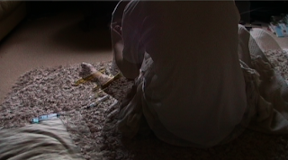
We decided to stylize our sequence a bit, which we know is against conventions of social realism, however, we felt that putting this specific effect in would make the sequence more effective in the way that the sequence suggests the male doing drugs. The filter shows the effect of the drugs on the male.
Fonts
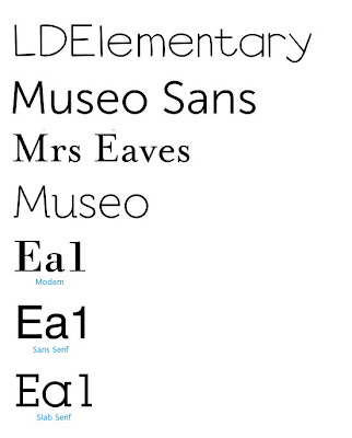
The font we decided to use was Arial, we decided this when putting our titles into our sequence as we couldnt find any of the fonts we wanted to use. We saw Arial and decided this was a good font to use as it looked the part that we wanted to achieve.

We liked this font as it was bold and dull which is the effect we were looking for.
Wednesday, 4 March 2009
Friday, 27 February 2009
Evaluation Questions
1. In what ways does your media product use, develop or challenge forms and conventions of real media products?
2. How does your media product represent particular social groups?
3. What kind of media institution might distribute your media product and why?
4. Who would be the audience for your media product?
5. How did you attract/address your audience?
6. What have you learnt about technologies from the process of constructing the product?
7. Looking back to your preliminary task, what do you feel that you have learnt in the progression from it to the full product?
Thursday, 26 February 2009
Rough Cut Deadline
We had problems with filming which means that we were worried about reaching th deadline for the rough cut, however, we now feel that we are going to be fine for the deadline and do our best to make the rough cut to a good standard.
Labels: Cassie
More Font Research
Labels: Cassie
Shot List
We decided to change our shot list as there was problems with our planning of filming. As we filmed later then we should have, we had to shorten the sequence to fit it into the time we had to film. At first we were dissappointed that we had to shorten the sequence, however, thinking about it more and more, we realised this would be a benefit for our sequence. It would be more conventional to use this shortened sequence.
New shot list:
- Male character asleep on the floor with a blanket over him. Different shot types, side angles, eye level and aerial views. This is to show where the male is and the different angles of him.
- The male character is being waken by an alarm/phone call on his phone which is by his side, along with some needles and syringes. The eye level shot is used to show the male moving and doing what he does every morning.
- The male character lays back down and snoozes for a few minutes (still at eye level)
- The camera then moves to infront of the character and shows him putting on his t-shirt.
- Then the camera moves to the back of the character and watches him from behind as it is suggested that he injects himself with something, trying to make the spectator assume it is heroin.
- At the same angle, the character falls onto his bed slowly and we watch him as his face relaxes.
- We then see the male arise again and get ready to leave his home. We watch him dress and put his shoes on. The camera is watching him from the side.
- Then the camera is watching the male walk through his front door and down the path with him turning and the camera following.
This is then the end of the sequence which runs on for about 2 minutes and is dragged out to see the male wake and rise like a normal day which everybody goes through. The male was origionally going to be a lower class male, but we had problems with finding somewhere to film to portay this, so we thought about it and realised that social realism can be of any class representation. We decided to represent the working/middle class.
Labels: Cassie
Filming Problems
Unfortunately we could not film on the Monday, when we had initially planned to film as our group did not pick up the camera, therefore corrupting the time of filming. Due to this, we had to film the week we came back to college. This is was also a problem as there was only two members of the group available to film as the other two were absent from college. This was an inconvenience because it was harder to film and decide on things with only two of us. We had to shorten the film opening sequence as we did not have enough time to film the second half of the sequence.
Labels: Cassie
Thursday, 12 February 2009
Production Example
Lighting
We have decided to use naturalistic lighting as this is one of the main convention of a social realism film. These are some examples of natural lighting in existing films,


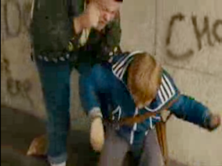
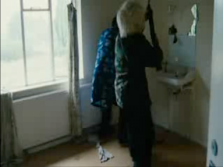
We will also be using natural lighting such as this.
we are using natural lighting because of the effect it gives, the clip seems like a documentary, very realistic and un-edited. We are using this as we want our scene to be portrayed as real life, natural lighting will give us this effect.


Labels: Sam
Titles
We come up with a few titles to go across the bottom of the screen whilst the sequence is running.
Karl Lambourne
Sam Perry
Pia Rolfe
Cassie Barker
Niall Folbigg
Rachel Chaplin
These are going to represent people who were involved in the making of the film. The titles will last about 1 minute, and then the opening sequence will last roughly another minute.
Contributor Release Form
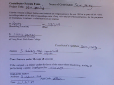
We did a contributor release for for the actor (Sam) to give his consent of using his image in our sequence. Real film producers use these to getpermission of people starring in the film to stop anyone from causing distress about using their image. We are using these slips to make our production more professional and show that we are capable of planning in depth and thinking about every possiblity.
Call Sheet
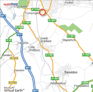
We have decided to film at Cassie's House in Sawston. We will collect the camera from college on Wednesday 18th between 12 and 1.
Filming on Monday 23rd February at 1pm.
First location is Cassie's house, second location is in the street and the other locations is Boots in the local village.
Production contacts:
Camerawork: Karl
Actor: Sam
Directors: Cassie & Pia
We all have each others contact details.
Emergencies:
In an emergency we will contact the police. The nearest A&E is Addenbrooks in Cambridge, just across the road from long road.
Cambridge University Hospitals NHS Foundation Trust
Hills Road Cambridge
CB2 0QQ
Wednesday, 11 February 2009
Test Footage*
We then filtered the video to make this more effective in the sense of social realism.
We used the filter Image control; desaturate. This drains out the colour from our shots and makes it look more like a social realist drama.
Target Audience
The target audience depends on the way the film is constructed and the content. The genre of social realism has its own independence. Considering our opening is based on social realism our target audience is probably adults no younger than 17. Then content of our social realism would be too dull for a teenage audience. Also it might be suitable for older viewers but I don't think it would be a mainstream production.
Wednesday, 4 February 2009
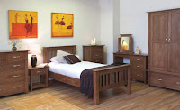
Locations
Labels: Cassie
Risk Assessment
Risks that could be avoided:
- Dropping of the camera. This could be avoided by using the equipment properly and making sure the group is handling the equipment with care.
- Tripping over. This could be unexpected but could be avoided by watching where one is walking.
- Being careful outside of college. Being aware of others around you and damaging the environment or disturbing natural causes.
- Being aware of traffic and pedestrians. Making sure that people are careful of roads etc.
- Making sure that our filming does not interupt anybody else or cause any harm.
- Damage of equipment. Equipment should be handled with care.

- Icy paths may be a hazard as somebody may slip over on it and hurt themselves. To avoid this, members of the group should be aware of the weather conditions and be prepared to look out for the icy paths or roads.
Labels: Cassie
Dialogue And Sounds
We have decided not to have any dialogue in our sequence as we feel this would ruin the convention of a social realism drama. We thought that we would have just diagetic sounds and emphasis them to show people what sort of sounds they miss out on everyday. People tend to get on with life and do not notice any sounds that occur all the time around them. We feel that emphasizing these, would help the spectator to realize what sounds occur everyday.
Labels: Cassie
Blog Feeddback
Positives:
- Lots of pictures for research e.g Props and locations.
- Lots of analysis
- Very descriptive
- Detailed mood board
- Good analysis of all the genres
- Original ident
- Good prop list
- Good analysis on different examples of their chosen genre.
- Pictures on costumes
- More connotations from images rather than actualy pictures i.e colours etc.
- Add test footage
- More information on the mood board
We will respond to the feedback as soon as possible as it could improve our blog a lot. The feedback is helpful as it highlights the things that we have done wrong or could suggest. We will change the things that other people have thought we should add. This will include adding more pictures onto the posts to help others to get a proper view of how things are going to be. Costumes will be added shortly as this is the only thing we are missing, apart from test footage which is in the process of being added. The test footage is going to be updated onto the blog as soon as possible.
Why is it essential to get feedback?
Feedback is important in the process as it gives us the information we need to improve our performance and get the best possible marks. Feedback shows us what we are missing out and gives us the chance to add it to the blog. Feedback is helpful and also gives us criticisms so we can improve or find out what we are doing wrong.
How does your blog compare to the thriller blog?
Our blog is very similar to our thriller blog as we have included everything we need and have everything up to date. This blog has a lot more detail in it as this is our second time round and are expected to be better. Hopefully, being up to date will carry on throughout the project.
Labels: Cassie
Costumes
We don't really have a theme for costumes, we thought we would just use casual, everyday clothing. As the genre is social realism we gave our characters a naturalistic look.
A casual look would be something along the lines of jeans a top and a jacket.
This is some shots of mise-en-scene and camerawork:
Thursday, 29 January 2009
Props
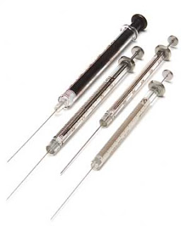
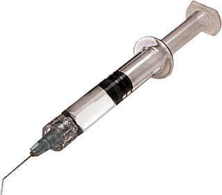
These are the syringes that are going to be on the mans bedside table which he will suggest to the spectator that eh will take when he gets up. Again we wil see a reaction shot of his face after he has taken the drugs. To suggest that he has without showing he has.
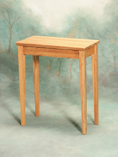
We are going to use a bedside table for the props to go on which will be the syringes and drugs. The table will be next to the characters bed, so we can see this in each shot.
Locations
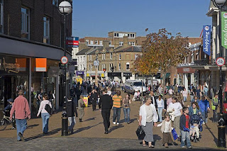_large.jpg)
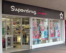
We will take pictures of the media studio when we begin to film and will be on here shortly.
In the mean while, here are the other places we are going to film.
Animatic
This is our animatic. We used a range of shot types and a variety of different diagetic sounds to emphasis the everyday sounds that people do not normally notice. The shots are quite long duration to try and show how we are going to drag out the shots. this was rather hard to show in the animatic as they are pictures and not clips. Although the shots are long duration, there will be many angles taht will be used. The sound we are going to use is going to be diagetic, everyday sounds such as people in the street, children playing and cars going past.
Storyboard
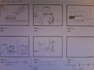
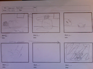
Some of the ideas were missed out as they did not fit in as ell with the rest of the sequence, however, many of the shots were used.
Wednesday, 28 January 2009
Shot List
Here is a list of our shots:
- A boy asleep in his bed. A side view, eye level.
- He wakes up, the camera pans to up above him to an aerial shot which shows the spectator what is around him.
- We then see him pick up a syringe, we will not see him insert it as this is a suggestion shot, we just see a close up of his face as he is doing it to show the unease.
- He gets dressed, this will be a long duration shot of different views of him.
- After this, the sequence is cut to when the boy is out. Different angles of him walking down the street.
- You see him walk into a shop and looking for something.
- The camera cuts to a pregnancy test on the shelf, and a hand that grabs it.
- We then see a close up of his face to show the suggestions of him stealing the test.
- He turns up at a house and shouts through the letter box to what is thought to be his girlfriend.
Pitch Feedback
In the lesson we presented our pitch to the rest of the group. This is our feedback:
"Good use of conventions of a realist drama. The way we have thought about lighting and sound in our sequence. We have thought about the problems that happen everyday and used them to produce an idea for a sequence"
"Good representation of social realism"
"Good research. We have thought clearly about where we are going to film and thought about having permission to film in a shop. "
Monday, 26 January 2009
Opening Sequence Analysis - Pia
Analysis of: Final Destination 3.
Mis-en-scene: The Mise-en-scene for the title sequence is generally dark with the bright lights of the fair ground and its rides. It has a Tarot Puppet type machine, which would tell your future and points to the death card, this future telling relates to the film as in each Final Destination film the main character in it would have a premintion at the start of the film showing various other characters and how they should have died and which order, of course things dont go to plan and most of the characters get off the ride, also in this 3rd Final Destination film this fortune telling is also later on shown in the photos the main characters, giving hints as to how they would die.
This is also shown in the titles as there are circus pictures relating to their deaths, ie. a girl with nails in her head & two women being electricuted.
In the Opening Titles there is also switched to a pinball which dodges the holes Luck & Fate, Ending up in the hole death.
Sound: The sound in the sequence is an ery music, with Screams getting louder throughout the sequence, creating a tension.
Camerawork: There are many different uses of camerawork in this sequence; Long shots, low angles, Dollys, Tilts, Pans, Close ups, Extreme close-ups & an Extreme long shot. The use of the low angle on one of the rides made it seem scary and menacing, this angle is similar to the way which anyone standing below waiting for the ride would see anyway, and this builds fear before they would go on the ride, so also builds up this fear in the viewer.
Editing: Disolved/faded tiltles & transitions, mirrored spinning ride, reflected/flipped ride & the horses from the carosel in the mirror had been sped up to build fear.
Sorry, i should have posted this before.
Labels: Pia
Mood Board
This is our mood board. We used images from the internet to put our ideas together. We used images that are other film titles that are social realist. The other pictures are to represent the things that are going to be used in our sequence. They show props, locations and lighting. The mood board is to represent our genre which is social realism.
Thursday, 22 January 2009
'This Is England' opening sequence.
Analysis:
Camerawork: This film has many ways of presenting the film, similar to ours which we will be using in our film opening. For example, the way natural lighting is used to show the effect of realism. This is how we are planning to film ours. Also this film is almost like a documentary and this style presents things as they happen each day, for example, marriage, classes, crowds etc. We will do ours fairly similar but not as much of a documentary as we will concentrate on the main character. The natural lighting consists of dark and light. They film at night and in the day, which is an easy way to film, as you don’t need all the extra lighting. The way this film is presented is in a way that represents Britain by showing people at war and the way community is brought together. The camera is hand held which proves this is a social realist as social realist films are low budget films so everything is done with less equipment. So the camera is handheld, this could be effective as it helps the spectator gain an insight and it draws the spectator in. There is a variety of shots used in this opening, which is effective as you get to see all the different angles and ways of viewing something.
Sound: The soundtrack included in this sequence is all diagetic sounds, this shows that the film is realist as you can only hear natural sounds. This is also what we will use in our film opening as we are using diagetic sounds but emphasizing them as people don’t normally notice these everyday sounds.
Mise-en-scene: This film opening is very similar to ours as we are going to have a boy get up in the morning and go out, this is what is included in this film opening, although there will be many changes, we just have a few ideas that are similar. In this opening, the little boy wakes and gets dressed then he leaves the house and goes to the shop. The way the sequence is set out, is in an old style. The film has the characteristics of a very old film. The setting is almost empty which could emphasize isolation.
Editing: There is not much visible editing in this sequence. The editing is continuous which makes it hardly noticeable to the spectator. The titles and credits are edited as they have transitions and the way they are placed on the screen. The shot duration is quite short in the titles, which makes each scene short and punchy to help the spectator view all of the scenes in a short amount of time.
Our Film Opening Synopsis
In our film you will see a lower class man, who doesn't have a lot of money, get out of bed over a series of long shots. We are going to focus on diagetic sounds of the man getting ready. This emphasises the sounds that are normally there but people don't noticed. This is commonly a feature of social realism. After you see the man sit up on the edge of his bed you see him use heroin. The mans a heroin addict and depends on crime to survive. We see the males everyday life style which introduces him in depth. There is only one character introduced who is the main character. This gives us an incite into what people like him are like. We will use natural lighting and show him slowly getting dressed and getting ready to go out. Later on in the clip you will see him going into a shop and stealing a pregnancy test for a un-introduced character. This opening highlights the problems of drugs and teenage pregnancies which are common themes of social realism.
Film Pitch
Today we have been preparing for our film pitch on the 26th of January. For the pitch we have to prepare a synopsis of what our film is going to contain and whats the storyline. We also have to prepare a mood board full of images that are related to our ideas of what our sequence could contain and also images of films that we have drawn inspiration from. Lastly we preparing two different analysis of two genre related films. We have made notes from watching two social realist film openings and noted down the main characteristics. We can use these in our own clip. After we have made our pitch we will add the feedback we receive.
Wednesday, 21 January 2009
Hostel title sequence
Labels: Sam
Monday, 19 January 2009
Ident
Last lesson we decided on an ident for our film opening and this is what we came up with. We found it hard to come up with a name so we decided to find a background first and the link the title in with it. We saw this background and liked it, then we decided on many names and the best, we thought, was BlueLight. The sound was created by all of us which went well with the imagery of our ident.
Thursday, 15 January 2009
Panic Room Analysis - Karl
Title sequence analysis - Panic Room
For my title sequence analysis I chose the film ‘Panic Room’. In this title sequence you see an interesting use of typography. The titles appear on the buildings and the camera pans over them. This is effective as it doesn’t draw your attention the names straight away and makes you focus on the city setting. Also in this sequence the music used is deep and orchestral. This builds tension and encourages the viewers into the sequence. The music is quite low and not too much attention is drawn to it. This allows the actual titles to take most of the attention. The camera work used in the sequence draws most of the attention the buildings in the background which gives the viewer a sense of where the upcoming movie is going to be set (in a city). Also apart from the buildings there isn’t a lot of action in this title sequence this leaves the viewer wondering what is going to happen. This slow start contradicts with the title of the film, ‘Panic Room’ because from the title you would expect a exciting, fast opening but instead you have the opposite.
Labels: Karl
Supernatural Thriller
Supernatural Thriller
A conflict between main characters - usually one has super powers. Combines thriller elements with basic horror ingredients such as ghosts.
Conventions:
- Usually dark lighting - dark themes and characters
- Distinctive gap between good and bad through appearance, where they live
- Involve unatural beings
- Character close to protagonist is harmed or taken or dies.
- Protagonist is usually female
- Conflict between main characters.
- Evil represented by humannor supernatural force or both
Examples:
Labels: Cassie
Teenage Romantic Comedy
Teenage Romantic Comedy
Very specific formula-narrative structure stereotypical representations. "Bad" character is often less conventionally attractive than others or different.
Conventions:
- The setting is often a high school, a main character has just joined the school.
- The main character may start off as unpopular then become accepted by others, usually followed by a make over.
- There is a joc character who has muscles, likes football, maybe aggressive, is always popular and attractive.
- A geek that is signified by glasses who likes education.
- Resolution of narrative - the main characters fall in love and its always a happy ending.
- The character is usually unpopular due to the way he/she looks
- The soundtrack relates to the target audience.
Examples:
Labels: Cassie


