More Font Research
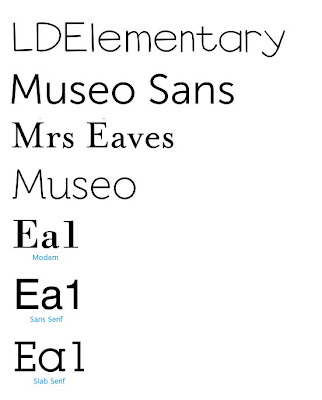
For our titles we decided to use a dull font, which has hardly any effects on it. A bold font which puts accross the conventions of a social realism. Here is just a few that i saw and thought would look good combined with our sequence.

We have not yet decided on any specific font, but we have decided to the charcateristics of the font, being bold and dull.
Labels: Cassie
0 Comments:
Post a Comment
<< Home